I aim to create figures which are just novel enough they catch a viewers attention, allowing them to keep one foot in comfort while the other steps eagerly across a precipice. A figure is not meant to the center of attention, that role is for the speaker or the writer. A figure is meant to be a powerful tool for a speaker to use to convey and convince others of their opinions, especially when proposing something new which may seem uncomfortable for the audience. A figure is most powerful when it foreshadows a solution, allowing our audience to come to the same conclusion as our speaker just as their thoughts are spoken out loud to them. No figure is complete until everything which can be stripped away from it has been stripped away from it.
There are few subjects which unite all factions of people. Fortunately, interactive figures seem to be one of them - is this at long last our opportunity for world peace?! Unfortunately I cannot embed these features directly into this webpage, but you can find two pieces on my other Github pages!!!
Colorado Buckwheat I am using this presentation to share some background information on a landscape genetic research project which prospective REU (research experience for undergraduates) can apply for. Essentially I am interested in using species distribution models (from random forests) as the variates in a variety of other models, which seek to delineate population geographic boundaries, predict plant counts, and hence population sizes, as well as the connectivity of populations.
Dune Goldenrod This is a piece used to recruit undergraduate research assistancts from Northwestern Universitys, and nearby universities & colleges. It is a DBSCAN based cluster of individual plants at a relatively fine scale (~1 mile distance).
The right tool for the job is usually the simplest one. Most problems can be resolved with a solid understanding of the issue at hand, the right framing, and fundamental statistics. These approaches are the the pillars of data science, which to me is using large opporunistically collected data sets to create value for stakeholders. These pillars should be allowed to shine bright without gaudy flourish which would be more apt covering up blemishes.
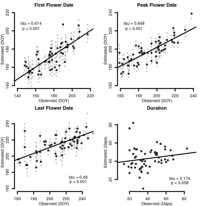
Scientists are working to better understand which plants insects rely on for food and 'housing'. Detailing this would require considerable amounts of field work and be quite expensive. Using pollen collected from an insects body, with molecular techniques, scientists can determine which plants it visited. However, the current molecular markers are not sufficiently detailed to work in groups of plants where species have minimal molecular divergence, and further filtering tools are required. For my masters I developed tools to filter plants in both space and time, which alongside highthrouput genomic approaches can answer these questions.
We wanted to determine whether the period over which a species of plant was flowering in an area of a few kilometers could be modelled at a daily resolution. If the plant was not flowering during this period, an insect could not visit it, and the DNA evidence must come from another closely related species. To model the flowering periods of plant species we used the weibull distribution, because we did not have enough data for machine learning. As you can see from our correlations on unused test data and the results from our training data the application this method is quite robust.
Our audience for this figure included many persons who had commonly criticized the application of the Weibull distribution for modelling phenological events. I had seem most of these people present, and I knew exactly what kind of aesthetics they liked, what they challenged about the use of the distribution, and how they like reporting statistics on figures. In a sense this had an audience of a couple naysayers.
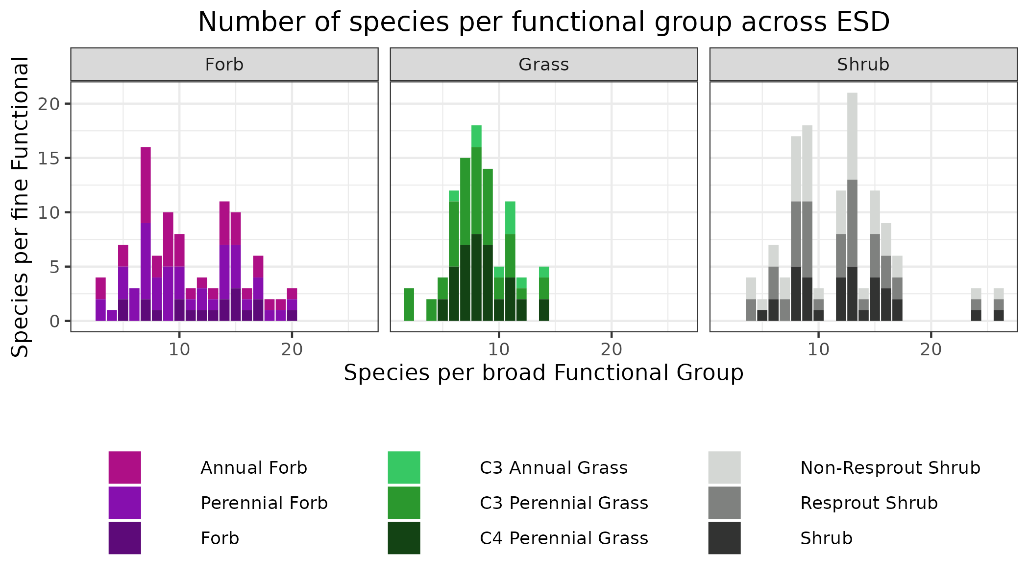
The barchart, crisp, clean, and concise. I don't stand by how complex what I pulled off here was - but it's difficult to not want to show off the composition.
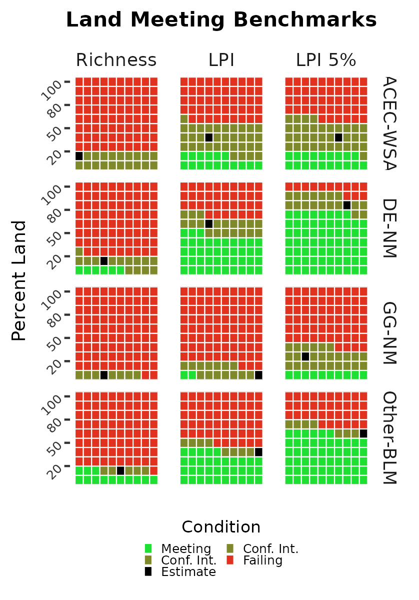
The Bureau of Land Management (BLM) is one of the largest land management agencies in the world. While the National Park Service steals all the lustre, and the Forest Service holds the nations heart, BLM administers just about as much land as those two combined. BLM came late to applying science to land management, but when they did they threw in every chip they had. In particular they have spent well over a $50 million rolling out a standardized assessment method to determine the environmental quality of their land.
The main question then is - what is the quality of BLM land? In order to answer this we used a longitudinal study for a sample frame with spatially weighted regression to document many parameters. Here we show the results for the amount of land, across a roughly 900 thousand acre field office, which has fewer than the amount of invasive species they should have. In other words, all of these plots should be green; and the waffle plot is like a pie chart, where each square represents 1/100 of the sample frame. At first glance the answer is quite bleak, but an optimist might find a silver lining. In the plots at left, we see that invasive species have been documented on nearly all land across the field office, including the areas which are meant to have more natural managment methods.
However, at center we see that the relative abundance of the invasive species are generally somewhat low. At right we see that invasive species have truthfully taken over much of the land in the field office. The audience for this figure are professional land managers who tend to adopt a business as usual mindset. It should be very clear this policy will not work, and modifications to practices must be made before the plots in the center and to the right look like the column of plots to the left.
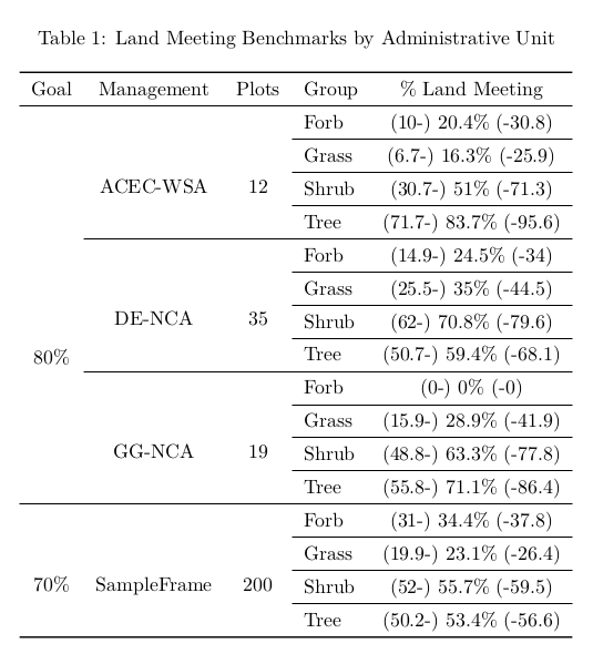
When it comes to simplicity the table still remains supreme. Any dislike for this method of displaying tabular data can only be due to crimes committed against it by people using these for data exploration rather than sharing a distinct point. While I absolutely love LaTeX and markdown tables, straight to the point methods with no distractions, I've also become partial to gtables.
This gallery has a few discussion of a big report for the government, I'll skip reviewing them here. Essentially, if we had to boil that down to a single figure. This would be it, their is also an illustrated version of this. But for the one person that this really matters to. This is it. Also note the clean crisp lovely lines of <3 LaTeX!
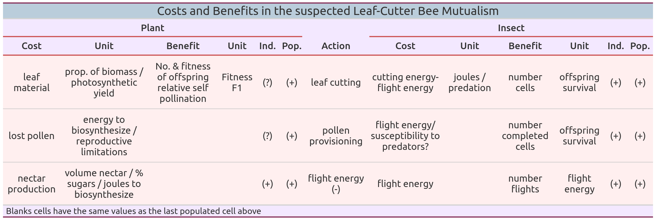
I think that the most beneficial use of tables are in conceptual figures! Creating simlated data can often take a long time, and people can get overwhelmed with details. But with a table you can combine text and formatting to guide people straight to where you want them to be. In particular I love to use them to compare and contrast groups.
In this table we address a question regarding how the fitness of individual plants in a population are affected by interactions with an insect which uses the plants as a source for both housing material (leaf tissue), food for it's young (pollen), and itself (nectar). While the interactions are overwhelmingly positive for the population of the plant and insect, as well as all individuals of the insect, we had to wonder - is this arrangement beneficial for each *individual* plant? Or are some parasitized rather than being in a mutually benefificial relationship?
This is for an audience of a few close friends, again we know how they think, what they don't believe, and the most influential ones favourite colours.
An update from a travesty of a conceptual figure from 44 years ago which still guides the prevalent lines of thinking in the field. Tailored to a younger audience, made more compact, and less verbose.
This table showcases the results for a take home teaching assignment. Target audience: my seasonal employees. They want something bright colourful, fun, and scrollable on mobile.
No method of data visualization has fallen so far from grace as maps. Despite the widespread admonishment of the medium, so strong are their powers, that I guarantee you 99% of people still think Europe is about as big as Africa, and would pick the wrong route to fly from New York to Hong Kong. A lie with a map has big implications. Here are some maps made to be as accurate to reality as possible, while still conveying my point.
Government agencies don't come by friends for free these days, so it's very good to keep the ones you have. This plot was created for an outreach event where it was meant to be displayed BIG, I don't recall the specs but like REAL BIG. We were working on a report and decided to two birds one stone it, and give ourselves a fun challenge... Could we create something that looked good at both 1x1" in a technical report, and many by many feet for folks drinking craft beer?
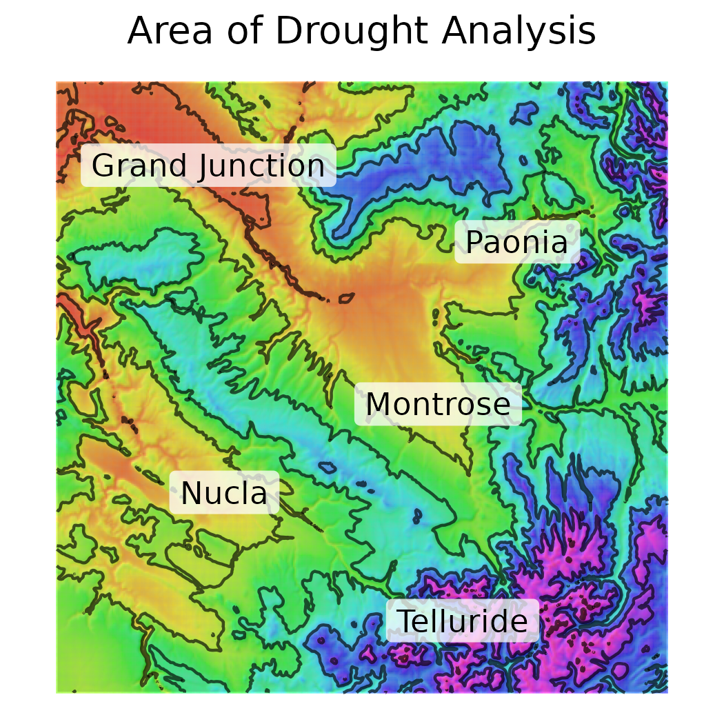
An astute observer of natural lands in the West will realize that the quality of land increases with increases in elevation. Some folks believe this is related to management agencies, but realistically it relates to the frequency and intensity of precipitation events; being predictable is good for plants. Here we showcase the change in the amount of annual precipitation along a gradient running from the red rock deserts of Western Colorado (Moab misses the map by about a dozen miles), to the peaks of Colorado's premier mountain range - the San Juans. The target audience for this figure were outdoor recreationalists in Western Colorado; skiers, mountain bikers, and white water rafters. These people know the content well - where does the water fall? But could use a *litte* reminder of the challenges faced in land management. This map is of course, made using a palette which nods to psychadelia, and the contour lines which were based on the precip amounts NOT elevation - although those are just about perfectly collinear.
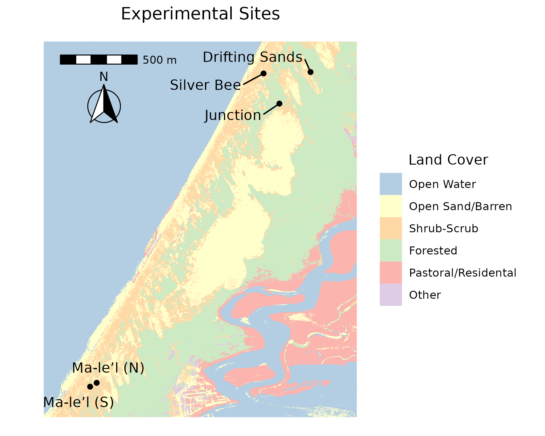
A supplmemental figure made for a colleague's publication at the 11th hour. As I recall we were meant to illustrate that while there was moderate geographic distance between these two groups of sites (the Ma-l'el sequence and others), they were in a similar environment. This is a two part figure, the first part is an overview map which contains a table of pairwise distances between these sites - it's not shown. That part is quite dry and effective for submission to a journal as a supplemental figure. This second figure on the other hand...
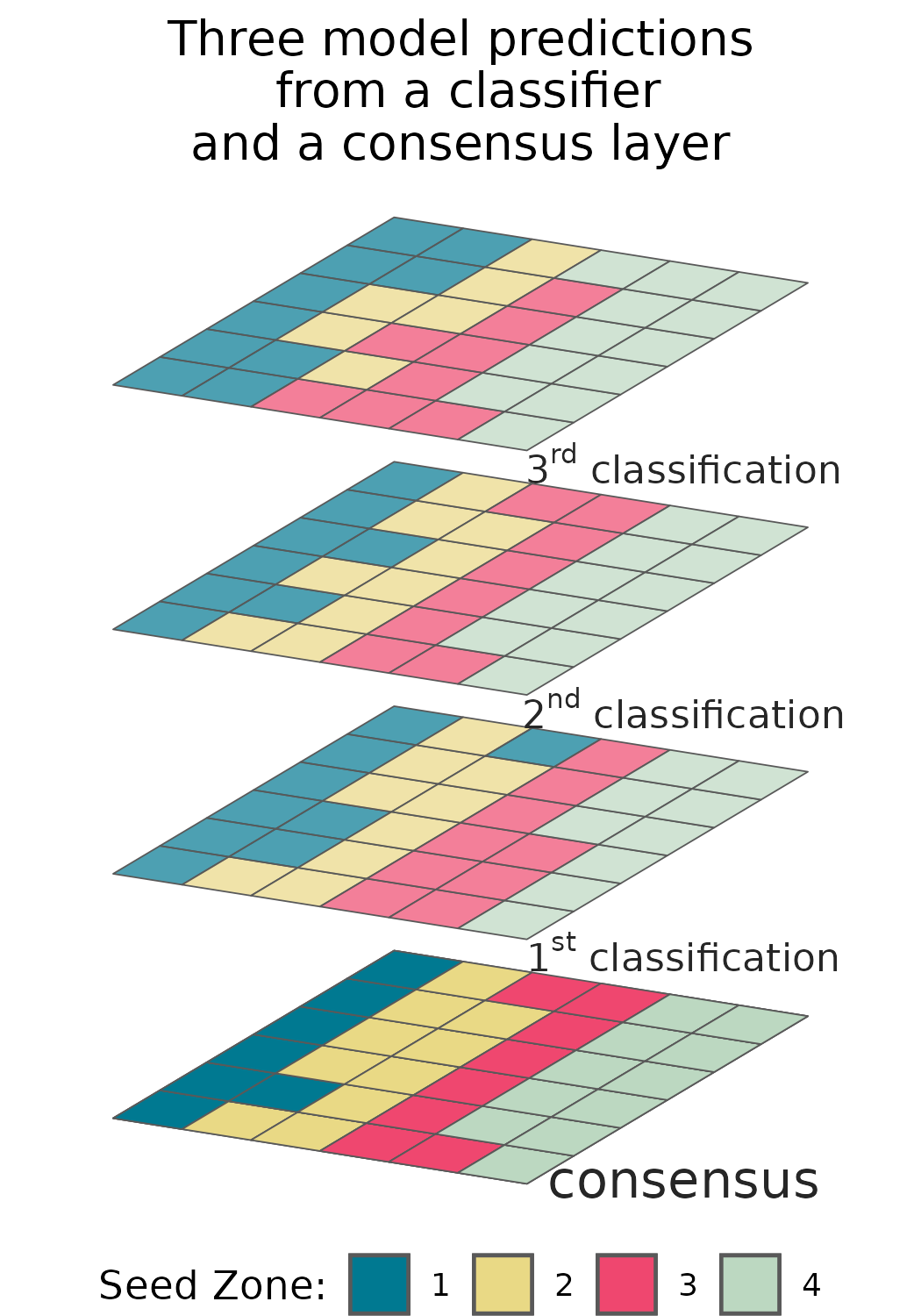
This second figure was quite fun! I had an existing random forest classifier developed for this landcover problem, and already had some gridded output to play around with. The area mapped is near a funky little college town called Arcata which has these cute colourful craftsman homes, in all these bright pastel Painted ladies colours, and I thought that would be a fun theme! The audience for this map was largely a professor at the university in said town who was a little skeptical of a few their results.
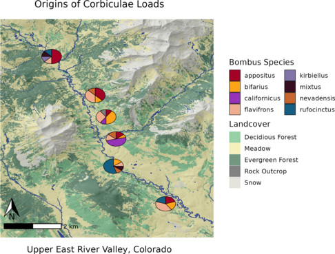
A supplemental figure for one of my publications. The audience for this figure are young hungry nerds who feel as comfortable in a tent as flashing linux onto bare metal and sequencing genomes. Rich in detail, emphasizing a faux pas among nerds of pie charts - which here covers the area which each sampling event was conducted over. Here we were trying to avoid any comments about pseudo-replication of sampling sites.
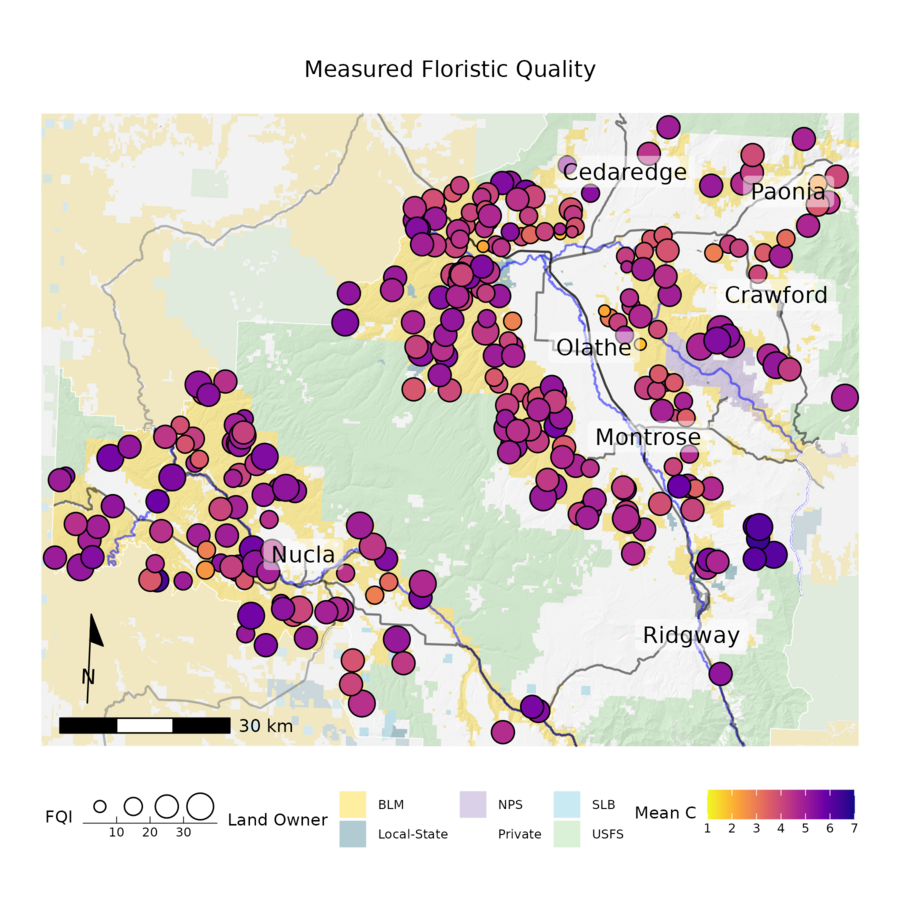
While the Bureau of Land Management (see XXX for details) has several official methods for quantifying land quality, a few alternative approaches exist. One which I am partial to is the use of Floristic Quality Indicators (FQI), which uses plant species as indicators of habitat quality. The idea is that some plants can only grow in very high quality areas while others are less picky. The FQI values are assigned by a panel of experts in a delphi survey like process to each species in an area, and then more or less a few simple averages can be calculated from plots where all plant species are identified.
The approaches officially sanctioned by the BLM have one big... problem... They rely on categorical classifications which cannot be smoothed out spatially in a manner any experts will agree on in the next decade; hence they cannot produce a map which can become an action plan. FQI avoids those complications. In order to spatially predict the quality of habitat across a BLM field office, all we need to do is use each plot as a response, and using some GLM's with dredging and eventual ensembling of models predict our response across a smoothed surface (not pictured - unless you read the full report), et voila! The main audience for this figure are both professional botanists, largely empoyed by different administrative units, botany professors, and enthusiasts, an overwhelmingly female demographic. While that's the audience, this figure still had to maintain the sensibilities of being in a dry and boring government report. Note the staistical method of using MuMIns dredge function was used in an attempt to appease both some old school folks who only believe in step-wise selection and demanded some sense of causality, and some new folks who wanted ML level accuracy in prediction; both camps found the results acceptable and my head was spared. It displays two strongly collinear metrics of habitat quality as the size and fill of points associated with ground control plots.
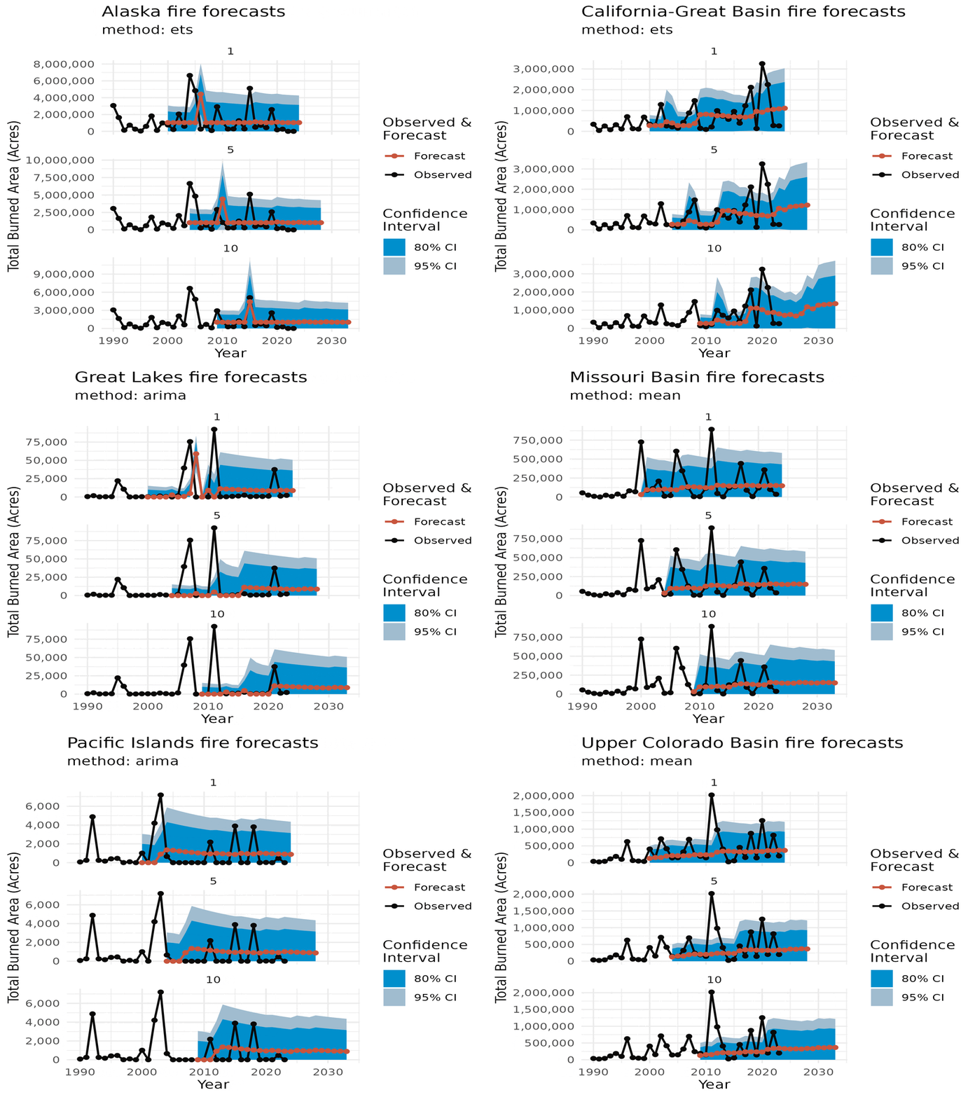
Interactivity is great, and so are big grids of many plots. However sometimes, you need to emphasize each and every point to elicit a feeling. Usually the overall feeling, not the specifics, stick with the users. For this I use animations. Unfortunately, most of my work here relates to natural disasters.
Here we have some forecasts for annual data, so no seasonal component, for a variety of analytical units. This was an audience of one presentation.
The fun thing about the bleeding edge is when you get to show off your results! But realize no way exists to do it yet. So then have to make a way to do it.
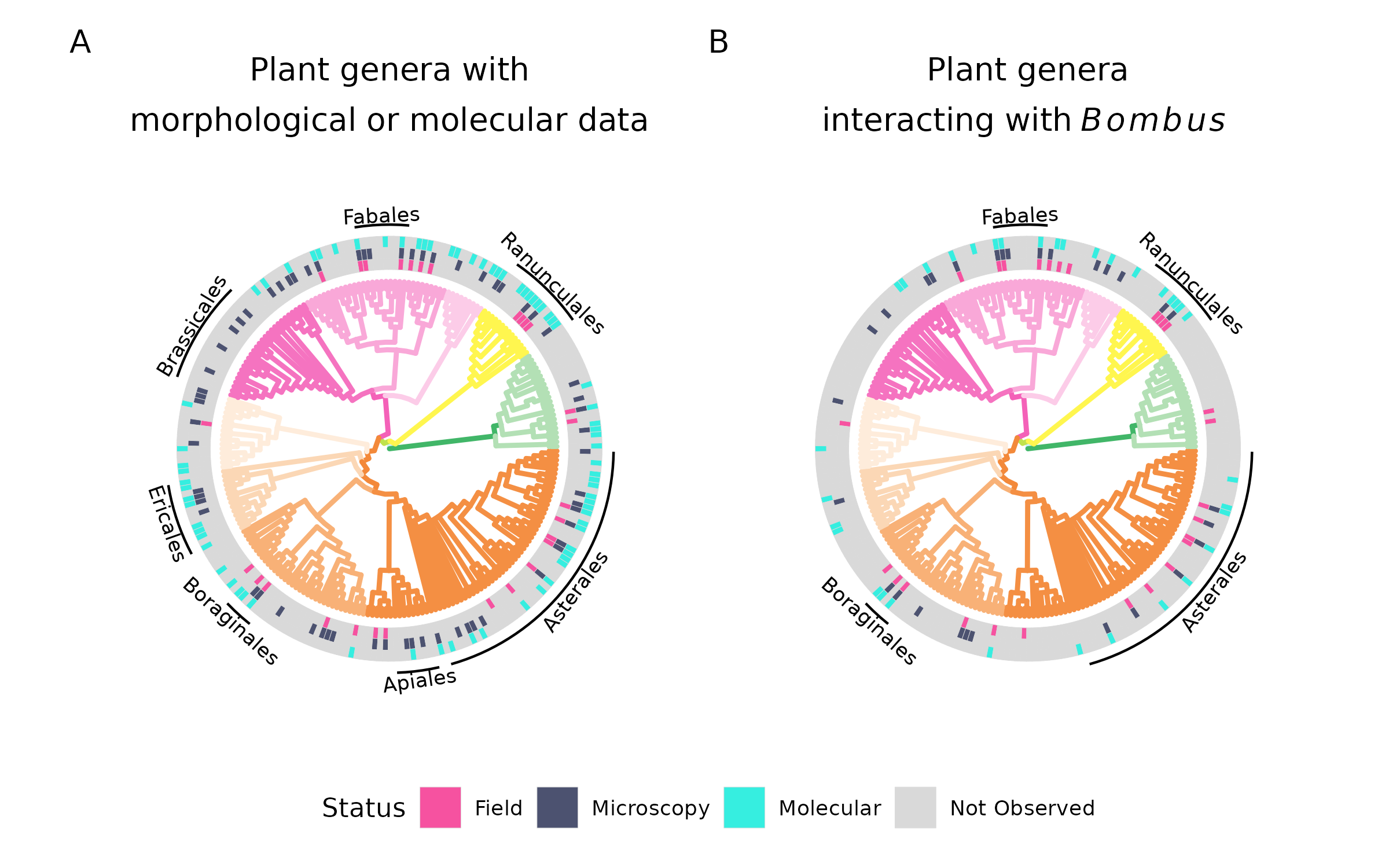
Another one from the Masters disseration, for the camper/Linux crowd. I contest this is nothing more than a pie chart, which is laid out to display phylogenetic relations - or a phychart ;-). Details here Any of the readers would be very very familiar with both of these forms of data representation and could latch onto this immediately - simple.
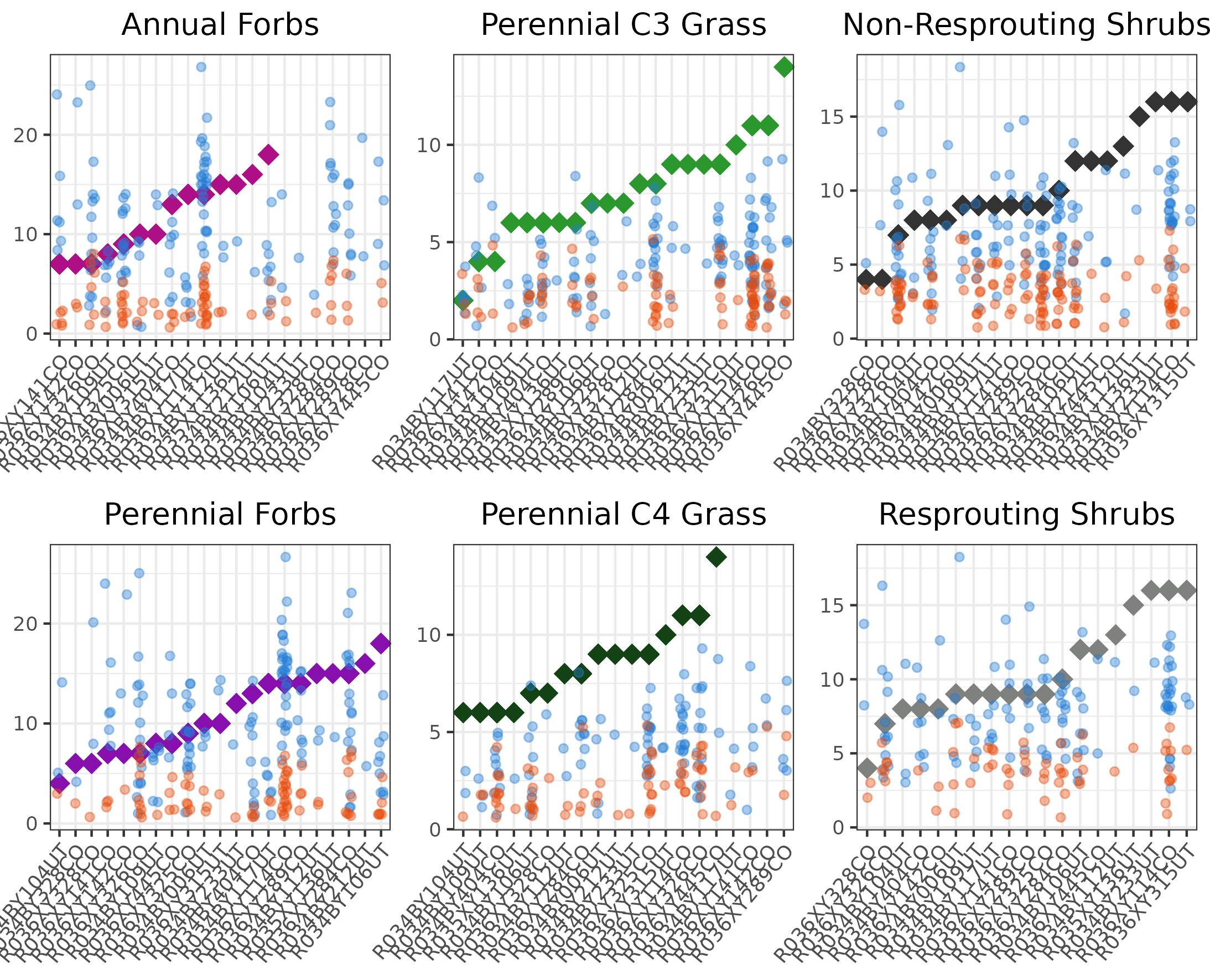
Where are you relative to your benchmarks?
A lot of learning to be a data scientist is feeling comfortable with your meat and potatoes approach which tends to kick the sh!t of someone else's overparametized and hideously contorted ML approach. But before that sense of confidence comes a lot of funky and cool plots. Some times these make sense to use. Some other times, while, we're all young once.
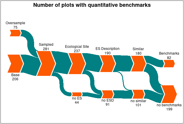
Our sample frame had 281 plots. We were assured we had benchmark references for all 281. As you can see that clearly wasn't the case. With a bit of unsupervised clustering, feature engineering, critical thinking, and some tough decisions and assumptions we perservered.
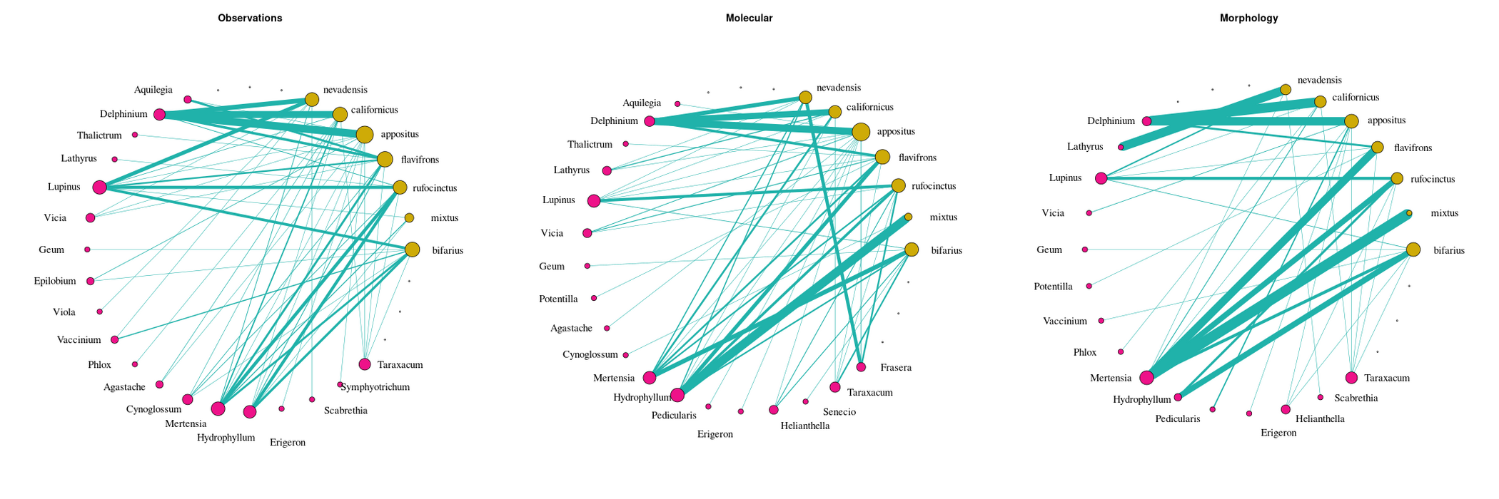
Part of the Masters. A comparision of graphs generated using three different lines of data. I loathe igraph and the other packages folks use in R, so I had to create a pretty extensize wrapper around them for visualiations. Check it out here.
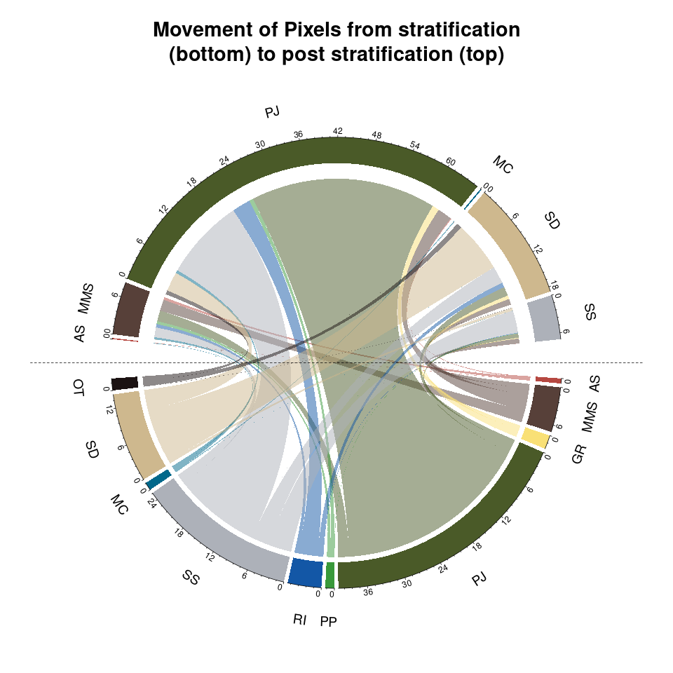
Somebody used some old classifier, developed by a pretty huge team over a few years, and I inherited an absolute mess. In less than a week we generated the training and test data, fit a random forest classifier using high resolution aerial imagery from four channels, and predicted our model onto a few tens of millions of grid cells. And of course we absolutely smoked the old product, by any evaluation metric under the sun, in the process.
I think most formats of displaying data are fleeting, but some messages will need to be communicated for a very long time. For these reasons, I make a lot of content using spatial objects and other coding approaches. This makes it so I invest the time to make high quality visuals which I know I can quickly tweak to the next flavour of the month.
Statistical models usually have two broad sets of data, an variable which needs to be predicted (dependent), and the variables which predict it (independent). When data sets have independent variables with coordinate information we can predict our model onto a gridded surface (a raster). However, predicting models onto these surfaces is computationally intensive. Hence, estimates of uncertainty (how accurate and precise our model is) are rarely predicted into space. As computational power has increased we argue that these measures of uncertainty should be widely distributed with spatial data sets.
The audience ranges from sophomore university students to tenured professors; especially in the environmental sciences and related fields.
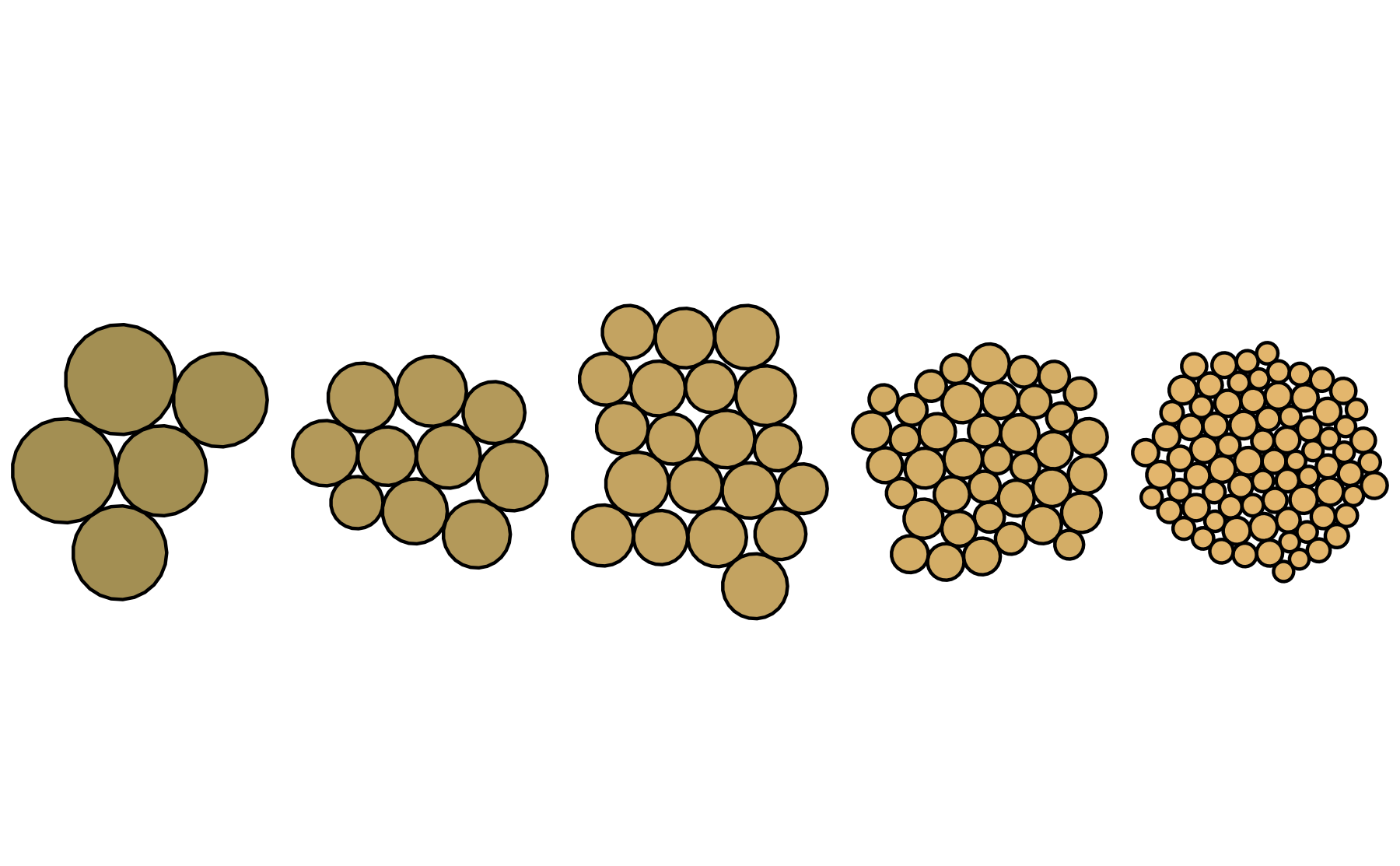
This is for teaching - it's a bubblechart or something similar with properly scaled sizes of sand grains. Beach sand is very coarse, however it's much more difficult to see the others without a hand lens. Hence, a lot of sand goes undetected!
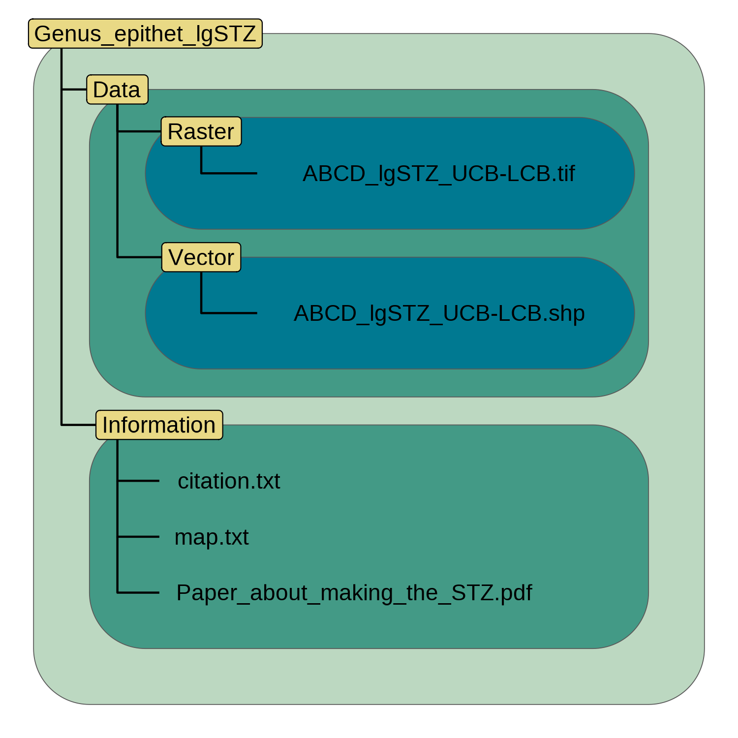
Do you ever have difficulty getting people to save files where they should be? Don't shame them, give them something pretty to bookmark!
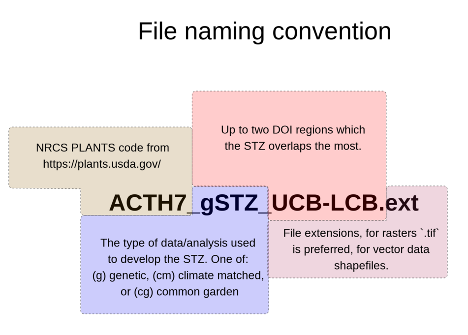
Nobody would ever mess up a file naming convention! NO WAY! But ya know having the format documented for new hires could be useful ;-).
I also enjoy creating aesthetically pleasing images. I hope to start integrating these more into presentations as custom backgrounds and themes which match the figures. So if a company has branding and wants that on a slide! Here's a cool super nuanced and quite way to do that in a way that doesn't look super corporate. Obviously with the following pieces we would throw an alpha pane on top of them to push them furter into the background.
This is the backdrop for a bookmark! I've been struggling to drive clicks to my software. Someone suggested making bookmarks which link to them! So here we go, created using the absolutely amazing (and inspiring!) repo Art From Code by Danielle Navarro.
Phyllotaxy are the distinct arrangements that leaves make coming out of a plant. This was on the back of an old business card along with the QR code below. Essentially the above image represents the cells of a plant stem in cross section - which species may be arranged like this I'm not sure! The values are imputed from a simulation.
Not made using code, but you have to get clicks somehow.